CHA 2016 Project 1 of 10
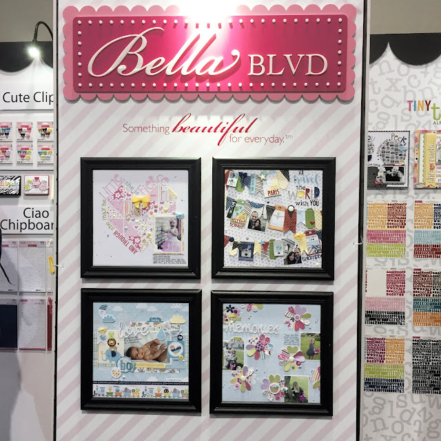
Here's a snapshot of a few of my booth projects. I was honored to have 3 out of 4 framed front and center in the booth.

Look at that adorable baby boy layout on the bottom left. I'm not sure who designed that but I love it. The two on the top and the one on the bottom right are my projects. And there's another one peeking out in the upper right corner.
So let's kick this off with a travel layout. My signature style is all about playing with patterns and creating fun backgrounds and this one is no exception. Take a look...

I was inspired to create this page by the Baggage Claim pattern paper with all the tags. I cut some out, combined them with the tickets from the Paper Pieces and started laying them out on the page.

Before I knew it I had hand cut flags, banners, tickets and more and arranged them back and forth across the page. I simply layered them over each other, added my photos as part of the banner and stitched them to the page.

One of my favorite parts of this layout is that I was able to document the location and sights we saw using the new tiny alphas, and I was able to fit them on the tags. I plan to add journaling on the red tag there in the middle. The dots will make perfect lines for guides.
Supplies: Let's Go: Air Traffic Control, Baggage Claim, Borders Papers, Treasures & Text, Paper Pieces; Cute Clips: Pumpkin Spice; Enamel Dots: Blueberry, Milk White; Enamel DooDads: McIntosh; Tiny Text Alpha Stickers: Black

No comments:
Post a Comment