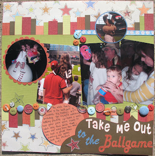
Nuts About Sketches. Here's the sketch and my take on it. I'm never one to take a sketch and do an exact, literal layout of it. Instead I consider it a recipe guide. When I cook at home using a recipe I inevitably add a little more of this and that or substitute one thing for another, either because I don't have it or because it fits my tastebuds better. On my layout I substituted paper strips for the torn paper effect and the flow of my photos didn't work with the way the sketch had them laid out so I flipped the sketch. Then I added an assortment of buttons, metals, brads and clear shapes to tie it all together. I created my title in Illustrator and cut it with my Craft ROBO, which I have a renewed love for again. My favorite parts are the 4 clear stars I stapled to the layout, 2 of which highlight the stars that are the same color as the Astros star logo AND the clear buttons that I applied white rub-ons to. I must say that I might change out the journal circle and make it look like a baseball. That's the one thing that's driving me nuts.

Supplies:
Paper - from JoAnns, will get manufacturer names
CTMH Buttons
Heidi Swapp Corduroy Buttons
CTMH Clear Acrylic Shapes
CTMH Circle Metal Accents
k.i. memories baseball ribbon
CTMH Tulip Ink daubed on all paper pieces
Misc Embroidery Thread
Title - cut on my Craft ROBO
Check out the other DT layouts at the
Nuts About Sketches blog
AND Join the
Message Board and tell them I sent ya!


No comments:
Post a Comment