Monday, March 31, 2014

STITCHED Class Sneak and Oh So Darling with Gossamer Blue

I've been having so much fun the past couple of weeks playing with with my new Gossamer Blue goodies and creating a project or two for the new STITCHED class at Studio Calico.

Before I show you what I made using the Main kit from Gossamer Blue, I thought I'd show you a sneak peek at my project for the STITCHED class because today is the LAST DAY to sign up.  I've seen other sneaks of the projects and I can tell that this is going to be an amazing class. DON'T MISS OUT!

The class kit along with the stitching templates, digital die cuts, printables and embellishments is soo amazing. And Paige Evans is teaching the class and has lined up AMAZING contributors. What more can you ask for??? I hope to see you in the class room tomorrow.  Register HERE.

Okay, let's chat Gossamer Blue. The April kit is full of bright, gorgeous Spring colors. If you are thinking of getting their April kit and add-ons, run, don't walk, over there now because she is selling out FAST.

I couldn't resist scrapping this photo of my girls with these gorgeous Sunflowers.

This layout was creating using the Main Kit Only. The add-ons are incredible but I wanted to show you an example of what you can create with just the main kit. Not only that, but I created this one in just 50 minutes. That has to be a record for me. Ha ha ha...seriously.

I started this page by just layering the transparency and the green under the photo. The transparency wasn't showing through enough to I added a pop of yellow and a bit of black. I then decided that I needed some white between the green and the grey background and voila!, I had my layers. These are all from various American Crafts Plus One or Day Dreamer collections and Studio Calico Lemon Lush.

Once I adhered it down, I added the "darling" and arrow rub-ons and the "oh so" from Thickers, all from the American Crafts Amy Tangering Plus One collection.

The page needed a top and bottom border so I cut some very rough strips on blue, green and black and added my borders, topping the upper right corner with an embellished triangle.

The page just needed a bit more happiness so I added mist splatters using Studio Calico Taxi and Bonnet Blue. Then I did the unthinkable (to me). I pulled the centers off the Dear Lizzy Day Dreamer wood buttons and used them like enamel dots on my page. You can see the wood around the "2" in the top photo and how they look peeled off in this photo.


Thursday, March 27, 2014

Beauty in Bloom

It's Spring time on the American Crafts blog. I created this layout for this week's theme and I had so much fun creating it. The Texas wildflowers are blooming and the butterflies are starting to make their appearances. I thought it would be fun to sprinkle flowers across the layout.
I started this page enamored with the lovely little banner floating in the clouds. I knew I had to use it for this sweet photo of my littlest. This photo was taken right before she took off running in the bluebonnet fields. 

I used a two of the alphas from the Day Dreamer collection and then I wrote the word beauty in my handwriting and then cut it using my CAMEO.  You can download the "beauty" Silhouette file HERE.


Next, I cut some flowers from both a 6x6 paper pad and 12x12 papers to create a cluster of flowers border. I sprinkled in pinwheels, buttons, brads, die cuts, rub-ons, enamel dots and other embellishments to add variety. 


I saved my favorite bit of the flower cluster border to use an an anchor for my photo.  I took a wood veneer bit that had the outlines of flowers and leaves and I painted them with water colors. I had to be a bit careful during the painting process because I knew that it might bleed on the wood grain. So, I always started in the center of the flower or leaf I was working with and filled it in carefully until I got to the edge.  I set it aside and then added it to the layout once dried.

Oh and if you look closely at the blue paper behind my photo, you can see that I used one of the new embossing folders from the Day Dreamer collection to tie it back to the "lovely" banner at the top.

I hope I've provided a bit of inspiration for you today.  Now, take a look at the American Crafts blog because I also posted a cute little Spring themed butterfly card. 

Thursday, March 20, 2014

#heatherhitsitalysolo2014 Part 2

So I have a confession: I didn't really do Italy completely solo. I mean I did but I didn't. After Day 1, one of my co-workers had arrived so we hit the city together. I had asked my Facebook friends where to go and Stephanie said I had to see Como so... when I told my co-worker that I was planning to take a train to Como, he was literally onboard to join me. We took the train from Milan to Como Nord Lago. We knew we wanted to take a boat ride around the lake and a tram to the top of the mountain but we had no idea where to find these things.

We got off the train, we didn't know whether to go this way or that way so we went that ---> way When, what to my wondering eyes should appear, but a gorgeous lake surrounded by villas, boats and lakeside restaurants. It took my breath away.


We strolled down the path along the lake until we got to that wall you see in the middle of the photo above. We walked out there and just admired the scenery.

Next, we kept on strolling until we got hungry. We settled at a lakeside restaurant for some pizza and pasta. Oh and some Marc Jacobs custom designed Coca Cola light (Diet Coke). (I was there during Fashion Week) And look at that view. I decided I could get used to having a view like this every day.


As we were eating lunch and enjoying the beautiful weather, we noticed that the entrance to the tram was right next to our restaurant. The stars were aligning! So we went up and up and up...


and up
and up
and up

 ...until we reached the top. We walked around and found the perfect spot to snap some photos, like this one.

We stayed up there for quite a long time, enjoying the different views of the lake as well as some businesses and homes that were at the top of the mountain. 

We spotted a beautiful church while we were up there and added that to our list of things to do. So, we took the tram back down the mountain and started walking in the direction of the church.

This photo above shows the beautiful steeple that attracted us to the church from high on the mountain. It's actually the back side of the church.
This is actually the front. It's soo pretty with a beautiful courtyard that I imagine lots of kids run around before and after church get all their energies out.

I didn't get too many photos on the inside and those that I did get, aren't that great...


After the church, we walked out and back towards the lake and whattaya know, the boat for the lake tour was right there. We got in line to buy tickets when I really large group of school kids, probably on a field trip, joined us in line. As much as I love kids, I really wanted a quiet, peaceful ride around the lake. We got out of line and went to the gelato shop across the street. Yummmmo! Once the kids were on the boat, we got back in line for the next one.

And off we went....


Hey! There's a view of the tram tracks going up the mountain.

Check out these mansions. I noticed that many of them had their windows boarded up, assuming they had winterized them since these are probably 2nd homes for the summer. 


Oh, the views were soo beautiful!  I was sad that I didn't get to stop in to say hi to George Clooney. The darn boat turned around before we made it all the way to his house. Sigh....

After that, we headed back for the train to Milan. I had to be back by 8 to set up for the event the next morning. 

On the way back to the train station, I saw this sign. COMO viva - enjoy COMO. I thought it was a perfect farewell for my time in this beautiful town. My co-worker must have thought I was crazy taking soo many photos. I spared you of them all and just showed the highlights.

Next stop, Helsink Finland and then South Africa. I'll blog about those trips soon.

Monday, March 17, 2014

Poppin' Tags @ Audrey's with my scrappy BFF's

I'm here to share a couple of projects I made using A Charmed Life and DIY Boutique collections.

"Poppin' Tags" PageMaps Layout | DIY Boutique
Dash by Heather Leopard SS

I love working with sketches so when the opportunity to worj with Becky Fleck's March PageMaps presented itself, I jumped at the opportunity. The sketch was perfect for documenting a girl's weekend with some of my favorite scrappy friends. The DIY Boutique collection, with it's bright colors and great sentiments, was a sure fit for fun times with friends.

To create this layout, take a peek at the PageMaps sketch and follow these easy steps:
  1. Trim a 1/2" inch off the top and one side of the grey woodgrain paper.
  2. Center over the polka dot paper and adhere.
  3. Stitch a 9" diameter circlein the upper right of the page, approximately 1 1/2" from the top of the grey and 1/4"  from the right. TIP:Draw your circle in light pencil first to use as a stitching guide. Erase after you've sewn  on the page.
  4. Cut a 6" diameter circle out of the bright pink paper.
  5. Cut a 5" circle out of the black/white polka dot. Adhere inside the pink circle. TIP: This is the B side of the pink paper so I cut these at the same time by simply cutting them inside each other. I just flipped the middle over and it was a perfect fit inside the pink circle.
  6. Stitch it to the layout overlapping the larger stitched circle as well as overlapping the black polka dot on the side.
  7. Cut frames out of the frame paper in the 6x6 paper pad. Arrange them around your photo.
  8. Embellish with sentiments, stickers, brads, etc.
  9. Add cards to the top and bottom to pull the layout together. 
  10. Embellish with more stickers, enamel dots, brads, mist, etc.
  11. Add your title and journaling to complete the page.
Dash Details by Heather Leopard

Dash Frames by Heather Leopard

Supplies from the DIY Boutique collection:
  • 6x6 Paper Pad | 5122
  • Insta-Frames | 5145
  • Chipboard | 5128
  • Brads | 5127
  • Outside the Box 12x12 Paper | 5106
  • Who's to Say? 12x12 Paper | 5107
  • Boutique Dots/Pink 12x12 Paper | 5113
  • Card Foundations | 5126
  • Stickers - Boutique | 5141
Thanks so much for stopping by my blog today. I hope you have a great St. Patty's Day!

Friday, March 14, 2014

Happy. Go. Lucky.

Hi everyone. I just wanted to share another project I made for the Simple Stories booth at CHA, using the A Charmed Life collection.
Happy. Go. Lucky. | A Charmed Life
Happy Go Lucky by Heather Leopard SS
I absolutely LOVE to stitch on my layouts and this one (and the one below) are no exception.  To create this layout, grab your A Charmed Life supplies and do the following:
  1. Cut the 6x12 Page Elements (Hearts) Paper in half to use on the right side of the page
  2. Cut the Navy Stripe Paper at 8"x12". Machine stitch in different places along the stripes with navy thread to get a tone on tone effect.
  3. Adhere the stitched navy paper to the left side of plain cardstock. 
  4. Adhere the heart paper to the right side overlapping the navy.
  5. Cut small strips of the Happy. Go. Lucky paper and adhere where the paper seams meet.
  6. Using the Green Stripes, Happy Times papers, along with 3x4 snaps cards and the tag from the Bits & Pieces, distress and layer them under your photo. 
  7. Cut the Happy. Go. Lucky. card from the Insta squares into individual banners. Staple over the photo.
  8. Add embellishments (chipboard, die cuts, fussy cut elements) to your page. Use pop dots of various sizes to add dimension.
  9. Add a journaling spot and you are done!
Happy Go Lucky Layering by Heather Leopard  Happy Go Lucky Journaling by Heather Leopard

Happy. Go. Lucky Project Supplies from the A Charmed Life collection:
  • 6x12 Page Elements 12x12 Paper | 3715
  • Navy Stripes 12x12 Paper | 3717
  • Happy. Go. Lucky. 12x12 Paper | 3707
  • Green Stripes 12x12 Paper | 3721
  • Happy Times 12x12 Paper | 3709
  • Insta-Squares | 3730
  • SN@P Cards | 3723
  • Chipboard | 3728
  • Bits & Pieces | 3729
Thanks for stopping by today!

Friday, March 7, 2014

The Sweet Life | Pattern Play - Repetition

Hi friends. I'm up on the the Gossamer Blue blog today with another rendition of Pattern Play. I usually like to mix multiple patterns and they are almost always busy patterns but I try to use them in an interesting way, like last month when I chose to mimic an element in my photo in the overall design of my layout, Dream a Little Dream
This month, I'm focusing on PATTERN REPETITION by reusing similar shapes and patterns throughout my design.  I also decided to use a gradiation effect, starting out smaller at the top and growing larger to the bottom. 
I snapped a photo of my youngest daughter enjoying an ice cream cone on a New York City street last fall.  The ice cream was melting and her face was covered in it. I decided to spare you those messy faced photos but I just thought this one was so sweet and innocent. She’s trying to catch the ice cream before it melts away.

I chose the background paper because it blended so well with the wall behind my daughter. Then, I was going to find a fun way to create the look of layers of ice cream throughout my page but then it dawned on me…my daughter is infatuated with sprinkles and this cone just happened to be covered in sprinkles. She spotted the sprinkle covered ice cream photo on the side of the truck and immediately knew which one she wanted. So…..I used different sized circles to represent sprinkles on my page.

I designed the page so that the tiniest “sprinkles” were at the top of the page, using the enamel dots and some small flowers from the 6x6 pad and used buttons, brads, small chipboard and small polka dots in the upper middle portion of my page and then lastly, I used the larger polka dots, which were cut from 12x12 paper and ephemera at the bottom. I chose to keep the focus on circles and dots to represent the sprinkles but it also helps the layout feel a bit cleaner and less cluttered. And it was all inspired by the ice cream sprinkles dripping down the side of the cone, hence my daughter’s sideways glance as she tried to catch them all as the ice cream began to melt.

I just adore this photo because it really captures the essence of the moment. I layered a few papers under the photo and then added my embellishments – geo tag heart, the coolest ampersand paper clip, a wooden dot and “The Good Stuff” banner. I couldn’t resist repeating one of the stamps. I focused in on the words “so good” and stamped it in gold immediately on the photo as well as the papers below. I also tucked a few more circles around the photo to keep the repetition throughout the page.

To create the title, I found the perfect words pre-printed on a scalloped circle on one of the sticker sheets and another word printed on a starburst/circle on the chipboard sheet.  I grouped them together and then added the letters to spell out the last word, angling them inside the circle to keep the repetition going.
By choosing to use pattern repetition as a key element in my layout design, it helped to clarify the overall effect of the layout and bring a sense of cohesiveness to it. The patterns may be a little more understated than usual but I love the impact it makes on the page. 
Thanks for stopping by today!

Wednesday, March 5, 2014

#heatherhitsitalysolo2014 Part 1

I love my job, I really do.  I work for a major computer company as a Portfolio Marketing Manager and I have the flexibility to work from home. I wouldn't trade that for anything because it allows me to see my kiddos on and off the bus, I get more accomplished during the work day and it makes mornings with 2 kids (one with autism) a little less chaotic. If the hubby and I had to add getting us both ready, along with the kids, and do the morning routine, we might all go crazy. Anyway, I also love my job because I am able to travel. I don't go too often but it seems that when I have traveled lately, it's taken me to some pretty incredible places. In November I got to visit Sweden (and meet Alex) and Ireland. And I just got back from Italy and Finland a few days ago.

If you follow me on Instagram, you probably already know that I was just overseas because I shared a few photos there using the hashtags #heatherhitsitalysolo2014 and #heatherhitsfinladsolo2014.  Here's a recap of my trip. WARNING: There's a ton of photos, like tons.  I'm only sharing a few and will spare you the 100's on my computer. Most were taken with my point & shoot and haven't been edited.

#heatherhitsitalysolo2014

It was a long flight over with a stop in New York City. These beautiful snow-capped mountains were my first view of Italy and a welcome sight.

I arrived at 8:40 am, got to the hotel and checked in early. I refused to listen to my biological clock that was telling me to go to sleep. I showered up and set out to explore Milan. I took the underground metro to Duomo not realizing the beauty I would see as I came up to street level.
Duomo do Milano: Milan Cathedral is the cathedral church of Milan, Italy. Dedicated to Santa Maria Nascente, it is the seat of the Archbishop of Milan, currently Cardinal Angelo Scola. The Gothic cathedral took nearly six centuries to complete. It is the fifth largest cathedral in the world and the largest in the Italian state territory. Source: http://en.wikipedia.org/wiki/Milan_Cathedral 

I bought a ticket to the top Terrace. I could have stayed up there all day. I must have been there a while, just enjoying the view, the weather, my religion. Here's what I saw on my way up:


Someone was creating his very own masterpiece and it looked great!


And the view from the top was just incredible:
In 1762 one of the main features of the cathedral, the Madonnina's spire, was erected at the dizzying height of 108.5 m. The spire was designed by Carlo Pellicani and sports at the top a famous polychrome Madonnina statue, designed by Giuseppe Perego that befits the original stature of the cathedral.


You can see the shine in my photo above but it doesn't do it justice. It was almost blinding and oh so beautiful.

I snapped a selfie on the terrace. Not sure why I am all squinty-eyes. Perhaps it's the sun shining back at me from the selfie.


This is where I could have stayed all day but there was too much to see and do, considering this was just my 1st stop.


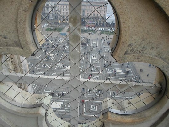
I can't believe I didn't snap a photo looking down from the terrace. I definitely looked several times.  I found this one on the "Interwebs". This photo of Cathedral (Duomo) is courtesy of TripAdvisor

On to the inside. It was a Sunday so I was in for Mass. I couldn't understand anything they were singing or saying but it was simply magical.


There were two bodies encased in clear glass and preserved for all to see. The masks covered their faces but you could see parts of their bodies.
Andrea Carlo Ferrari (13 August 1850 – 2 February 1921) was a Cardinal of the Roman Catholic Church who served as Archbishop of Milan. His body is in the cathedral. Wikipedia


The Blessed Alfredo Ildefonso SchusterOSB (18 January 1880–30 August 1954), was a Benedictine monk and Cardinal Archbishop of Milan during World War II. He was beatified on 12 May 1996 by Pope John Paul II. Wikipedia

Next was Galleria Vittorio Emanuele II. It was Fashion Week so I needed to get cultured. ;)

The grand entrance to the Galleria...

First thing I saw when I walked in was a photo shoot taking place in the middle of the hustle and bustle.  I slying pulled out my iPhone and snapped a photo. The model is the one in white in front.
He must have walked back and forth a million times for them to get the perfect shot. I was fascinated a watched a bit from the sidelines along with a gazillion other people. Oh and there was another photo shoot in Duomo square and another in La Brera that day. They were all over, everywhere I turned.

I left the mall on the opposite side and ran into a few street performers, like this one.


Tickets to see The Last Supper painting by Leonardo di Vinci was sold out. I had to do the next best thing and visit his statue. Add the museum to the list of MUST SEE when I come back with my family.
I ventured across the way to Teatro alla Scala - it's an amazing place for the opera and ballet.

For now, it was just me and I loved it. I walked and walked and walked the streets of Milan, bundled up in my warm jacket, just enjoying the architecture and culture.


I got to La Brera and walked into Brera Academy of Fine Arts. This is the 3rd spot where I walked upon a photo shoot but what was most interesting was the Napoleon statue that was taken down to be renovated.
It was inside a tent. The cool thing was being able to see parts of it up close. Otherwise, I would have had to look at it like this, if it was still standing in the middle like it's supposed to:
I snapped this pic from a book I found in the museum. Is that bad?

Keep on walking on the cobbled streets...

^^^ I spy a heart shaped rock ^^^ 


Flowers carved out of vegetables? Wha-what???

Finally, gelato!
Chocolate chip & pistachio. I added chocolate to the mix the next time and ordered a medium instead of a small. 

I had lots of Pizza margherita on this trip, though they didn't look like this.

Oh the wine...so smooth.

My dogs were tired and it was time to head home. 

After all, I had walked in and out and around the inner and outer yellow line multiple times, almost all day.

But not before I made it to Castello Sforzesco (Castle of Milan). It was closed by the time I got there so I've marked it down as another MUST See when I come back with the family. It was wonderful to walk around it though.

A trip to Como was on the itinerary for the next day. I'll cover that in another blog post.

Oh and if you are wondering what took me to these places, I am managing a Global roadshow to train our sales and channel partners on the latest product and solutions we have to offer. I manage the logistics, schedule, speakers, etc. for approximately 80 events worldwide. That's in addition to my regular job. ;) I am only going to a select few of these events, thankfully. I couldn't be gone too much from my family as it's hard on us all to have one of the parents away. But sometimes duty calls and sometimes it allows us to see parts of the world that we haven't seen before as well as get a bit of much needed respite. 

Stay tuned for Part 2 coming soon.