Pages

Thursday, February 25, 2016

Be-ing You-rself

The design of my layout was literally inspired by the food my daughter was eating in this photo.  I just snapped this every day moment while we were enjoying a beautiful day on the patio of a nearby restaurant.  I love how this just shows her sweet-little-happy personality.

I just snapped this every day moment while we were enjoying a beautiful day on the patio of a nearby restaurant.

I decided to create 2 sets of tulips in a quilt type design, which I created in Silhouette by mixing triangles with different size squares.

Download the Quilted Tulip Silhouette cut file.


 I laid the tulips out in a symmetrical format but you could use them in so many fun ways on a layout. The photo is slightly larger so that once layered, it overlaps all the tulips, leaving just enough space on the sides for a long title and an area below for journaling. For my title, I chose to highlight specific words within words to add a little more fun to the page. It also serves as an underlying message to my daughter.

Supplies: Bella Blvd. Sweet Sweet Spring: Her Bunny Hop, To Dye For, Paper Pieces; Let's Go: Taxi; Color Chaos: Words of Wisdom; Just Add Color: Treasures & Text, Trinkets B & W; Invisibles: Amore; IF Whatever is Lovely: Treasures & Text; Tiny Text: Bold & Beautiful, Wild Berries, White, Black; Ciao Chip Elements: Flowers & Clouds, Hearts & Stars; Enamel Dots: Punch

Wednesday, February 24, 2016

Can't Stop Growing

Hello my wonderful, fabulous friends. I have an announcement that I'm very nervous about at the bottom of this post so please read until the end.

I'm sharing another rendition of Pattern Play over on the Gossamer Blue blog today. I'd love to have you hop over there and say hi.

As I was sorting through all the fabulous Basic Grey goodies in this month's kit, I wanted to do something really fun with the patterns from the 6x6 paper pad. I decided to hand cut large alphas based on something my daughter tells me when I ask her to please stop growing up.  I'm certainly not the first to do this but it was the first time for me to do this so I'm here today to give you some tips.


How to: To create this layout, I first determined where my photo would go and then I decided what I wanted this quote to say.  Since the photo is one of my daughter getting measured a few years ago at the doctor's office, I knew that quoting her would be a perfect match.  Next, I determined how many words and letters would be needed, measured the space I had and determined 2-ish inch tall letters would do the trick.  TIP: Cut a 2-ish x 2-ish square out of the paper you want to use. Then cut the letter out.  This will ensure that you don't go larger than you intended.


Next, I placed my photo in the lower middle left side. It looks kind of bare just sitting there so I hand cut some flowers and added them behind the photo to frame it out.  I also added a few embellishments!


Once I had the photo and flowers in place, I placed my quote on the page. I added additional hand cut flowers around the perimeter and even used a flower for one of the "O" letters.  I pretty much used up every inch of this page. And then I added mist splatters.  It's busy and full and I love it!  Hoe's that for playing with patterns?!?!

Supplies: Gossamer Blue main kit, Add-on #2, Bits & Pieces kit

So, for my announcement...I've joined in on Periscope and I'm nervous as hell but I'm going to ask you to tune in anyway. It's sure to be a good laugh at the very least but you'll also get to see all of the wonderful items that are offered in the Gossamer Blue March kits.

Join me on Thursday at 3:30 EST / 2:30 CST / 1:30 MST / 12:30 PST as I do an unboxing of all the March Gossamer Blue kits.  I haven't opened them yet so I'll be discovering it all along with you. So whattayasay?  Will you join me?


Monday, February 15, 2016

Happy Happy Joy Joy!

For today's Gossamer Blue design team blog hop, I thought I'd share the layout I created using the Main Kit only.  This month's kit ironically focuses on the new Basic Grey collections, which is great seeing as how BG recently announced they are closing their door. So sad.  At least I got to play with the latest and greatest one last time.


This layout was so fun to create.  I literally just cut some diagonals from the large yellow sheet and added the scraps, which are the stripes from the B side of that same sheet. Then I filled in with coordinating greys to fill in the empty spaces.  I wanted a fun and funky geometric background so that's what I created.


I stitched the edges of the yellow in white but it didn't show up enough so I stitched a 2nd row of dark grey.  Next, I relied on the various alphabet options in the kit to create the title.  The HAPPY wood veneer was what inspired which photo to use (celebrating daddy's birthday). I added dark grey mist to it to help it pop off the page.  Then the rest was a combo of different elements.


I used scraps of the grey / white paper as journaling lines, cutting them into journaling strips.

Make sure to follow me if you are on Instagram (@heatherleopard). I have several giveaways planned this year (with one coming up this next week).

You don't want to miss my sketch challenge HERE for a chance to win a prize package of Crate Paper Shine and We R Memory Keepers.

The next stop on the hop is the fabulous Jill Keller.

Find the full blog hop list here:
Andrea Gray | Chantal Philippe (you are here) | Eunyoung Lee | Diane Payne | France Wisniewski | Me | Jill Keller | Kellie Winnell | Kelly Xenos | Michelle Wedertz | Patricia Roebuck Rebecca Luminarias | Sandra Dietrich | Sian Fair

Saturday, February 13, 2016

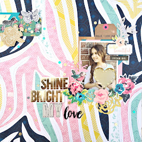
Shine Bright My Love

Hello everyone!  I'm so excited to be participating in the Clique Kits / Just Nick team-up and to welcome you to my blog. Today I'm sharing one of my most favorite layouts that I've created in a long time. I mean it is the new Crate Paper Maggie Holmes Shine collection afterall.

I showed a sneak of it last night on Instagram (@heatherleopard) and now you can see the full details here.  Come take a look...


If you are new to my blog, let me tell you a little about me.  I kind of sort of like to create fun backgrounds for my layouts. Whether it's repeating a pattern or paper piecing, it's just my thing. My signature style so to speak.  When I saw the exclusive cut files Nicole created for this team-up, I had this fun idea for using the zebra cut file. Do you ever have an idea but you're just not sure if it will turn out the way you have envisioned it in your head? That was me with this one.

The only thing I knew for sure about this layout was the photo of my oldest and the patterned zebra background.  As I was looking through the cardstock stickers, the "SHINE BRIGHT" stickers jumped out and landed on my page.  How perfect for this ray of sunshine holding a lit up heart.

How to:
  • Cut the zebra cut file out of white cardstock. Keep the strips that you are not using and set them aside.
  • Use the strips you set aside to serve as a guide for cutting the pattern paper.  Make sure to leave about a 1/4" edge around the cut so that you can adhere it to the back of the cut file.
  • Once all are adhered, stitch over the white cardstock.
  • Add some layers of paper behind your photo, leaving a pocket for a journaling tag.
  • Add sentiment stickers to the top right and an array of flowers on the bottom and around the sides. Adhere some to the photo/page and use foam adhesive to others for dimension.
  • Add your title in one of the open spaces. I chose the middle left tucked into the flowers.
  • Add an embellishment cluster to the top left of the page to balance it out.

Turns out that this layout is one of my most favorite that I've created in a long time.  I hope you enjoy it as much as I do.

Make sure to follow me if you are on Instagram (@heatherleopard). I have several giveaways planned this year (with one coming up this next week).

You don't want to miss my sketch challenge HERE for a chance to win a prize package of Crate Paper Shine and We R Memory Keepers.

Take a look at what the designers for Clique Kits and Just Nick did for the team up.  Melissa Vising is up next but you can find the entire hop below

Clique Kits | Me! | Melissa Vining | Suzanna Lee | Leigh Ann Odynski | Melissa Elsner | Carolina Schulz | Jaclyn Rench | Aliza Deutsch | Diana Waite | JustNick Blog


Friday, February 12, 2016

DIY Valentine Canvas Decor

I wanted to create something fun-loving and festive for our entryway for Valentine's Day.  I was strolling through the craft supply store looking for items to make a different project when I stumbled across some canvases and that's when inspiration hit me.  It wasn't anything specific that hit me, it was really a rack of small canvases that caught my attention.


How to: I originally planned to paint the horizontal lines on the canvas and as fun as that would be, I changed my mind at the last minute and decided to use pattern paper.  I'm glad I did because I love the subtlety of the "love" words in the background.  I cut those in 1" strips and used mod podge to adhere them to the canvas.  Next, I cut 1" flowers from one sheet of ombre pattern paper. My original plan was to mix up the colored flowers throughout the heart but another last minute decision came along and I decided to arrange the flowers in the ombre design.  Lastly, I added white, pink, dark pink and red enamel dots to some of the flowers.


Supplies:Bella Blvd Valentina collection: See You Soon, Love 12x12 paper; Enamel Dots: Milk White, Cotton Candy, Punch, McIntosh

Wednesday, February 10, 2016

You + Me | Scrapbook Circle + Just Nick

Love is most definitely in the air over at JustNick this week and I'm here to show you how I used hearts to repeat a pattern and make a fun background for my layout.

For today's layout, I used this new Patterned Hearts cut file. I opened up my Silhouette Studio and placed all 4 hearts from the collection across the page as well as down the page and made them so that they would line up evenly and fill up the page. Doing this in the software helps ensure everything will fit on the page and also gives me an idea of what it will look like.  Then I cut them all out and saved all the hearts as well as the cardstock I cut them out of.


I decided to only use 3 of the heart designs and leave the 4th space blank to incorporate coordinating papers and my photo.  I backed the 3 designs with 4 different types of papers and set them aside.  Next, I stitched the negative sheet of cardstock to a black and white pattern paper so that the pattern paper would peek out from under some of the hearts.  I stitched around each of the hearts, leaving  3 of them blank. I in turn added the coordinating pattern papers to the back using foam adhesive.


Lastly, I stitched some hearts down the middle and  attached other hearts on top using the adhesive dots.  I like the varied dimension of having some popped behind, others popped above and the way the others that are stitched lift up on the sides. I finished the page by adding embellishments, some gold mist splatters and a little bit of watercolors.

P.S. I've used this idea of repeating the patterns and replacing one of the shapes with a photo HERE, HERE and HERE. I wanted to show you how you can use the same concept with different results.

Tuesday, February 9, 2016

Sketchy Scrapper - January 2016 | Giveaway

WINNER UPDATE: please scroll to the bottom of this blog post to see all the entries and for the winner announcement.  Click the "tags" at the lower right of my blog to play along with the current Sketchy Scrapper challenge.  Remember that you can use any of my layouts or sketches as inspiration. It doesn't have to be current month only.  I just want to see how I may be inspiring you to create!

Hi everyone.  I thought I'd try something fun here for 2016. I know we all like to get a little SKETCHY sometimes so I thought I'd introduce a new concept here on my blog. I call it the...


I've taken each of my January layouts and turned them into sketches.  I'll be posting them at the end of each month for you to download. I'll give you until the following month to play along for a little prize package.

Here's how it will work:
I'll post the sketch and the layout I created along with a link to my the original blog post for that layout here on the blog, which usually includes some how-to's and tips.  Simply right click the images to save them to your desktop or sketch folder and print them out. You can also Pin them to Pinterest by hovering over the image and clicking the Pin It button. You don't have to follow the sketch exactly. Just let it inspire you. I want to see what you create with them so I can ooh and ahh over them. You can use sketches from any previous month but it must be submitted by the 29th to be eligible to win the month's prize. You may enter as any times as you wish.

Here's what you need to do:
Create a project based on any or all of the sketches and link it up below. You can link to your blog, a gallery, Instagram (@heatherleopard), or just upload your photo to Inlinkz.  You can also post your project to Instagram but please include the following so I will see it - tag @heatherleopard and use the hashtag #sketchyscrapper.

Here's what I'll do:
I'll randomly draw 1 name from any entries I receive on this blog post, Instagram and Facebook and send a little prize package to that person.  Easy peasy, lemon squeezy! See this month's giveaway at the bottom of this post.

Let's do this!  Here are this month's sketches.

The best of ME | Just Nick Studios Cut Files
   
Original blog post with the How-to can be found HERE.
Right click the image to save to your desktop or Pin them to Pinterest by hovering over the image and clicking the Pin It button.

Our Love is Like XO | Gossamer Blue Pattern Play
  
Original blog post with the How-to can be found HERE.
Right click the image to save to your desktop or Pin them to Pinterest by hovering over the image and clicking the Pin It button.

Happy New Year! | Gossamer Blue
  
Original blog post with the How-to can be found HERE.
Right click the image to save to your desktop or Pin them to Pinterest by hovering over the image and clicking the Pin It button.

I'd Travel the World with You | Bella Blvd CHA 2016
  
Original blog post with the How-to can be found HERE.
Right click the image to save to your desktop or Pin them to Pinterest by hovering over the image and clicking the Pin It button.

Love, Love, Love You | Bella Blvd CHA 2016
Original blog post with the How-to can be found HERE.
Right click the image to save to your desktop or Pin them to Pinterest by hovering over the image and clicking the Pin It button.

She is Fierce | Bella Blvd CHA 2016
Original blog post with the How-to can be found HERE.
Right click the image to save to your desktop or Pin them to Pinterest by hovering over the image and clicking the Pin It button.

Adorable, lovely, fabulous family | Bella Blvd CHA 2016
Original blog post with the How-to can be found HERE.
Right click the image to save to your desktop or Pin them to Pinterest by hovering over the image and clicking the Pin It button.

Bushel and a Peck | Bella Blvd CHA 2016  
Original blog post with the How-to can be found HERE.
Right click the image to save to your desktop or Pin them to Pinterest by hovering over the image and clicking the Pin It button.

If you are looking for something to do this weekend, I've just loaded you up with 8 sketches and 8 inspiration layouts.  And here's the prize that's up for grabs.


To enter to win:
Pick your favorite sketch and try it out, then link up your project by clicking the Inlinkz button below. You can also post your project to Instagram but please include the following so I will see it - tag @heatherleopard and use the hashtag #sketchyscrapper.  You have until Feb 29th to play along. You may enter as any times as you wish.


WINNER UPDATE: Thanks to everyone who played along.  I am so honored you chose to create with my sketches.  I combined the submissions from InLinz for submissions 1 - 6 and any submissions in comments/Instagram/Facebook (there was 1 = 7th entry) and used Random Number Generator.

CONGRATS to Stacie D.! Please email me (heather at heatherleopard dot com) or DM me on Instagram with your address so I can get the prize package out to you.

Monday, February 8, 2016

Love You More | Shimelle

Last week I made a BIG announcement on Instagram, which is where I seem the be the most lately, I realized I never blogged about this so....you guys! I'm trilled to say that I am an ongoing Contributing Designer for Shimelle.com.

Here's a short little story....
A few years back when I was just venturing into the online world of scrapbooking (around 2010), I stumbled across this website and was immediately sucked in.  Shimelle's site was the VERY FIRST one I ever bookmarked. I remember this very distinctly because I loved it so much.  I was so fascinated with all the amazingness that was there. So when I saw that I am thrilled, it's actually an understatement.  It's all come full circle and I am now a monthly contributor to this very same website and her amazing scrapbooking collections. After spending hours with her, her hubby, son and my hubby in London after I was selected, I now consider her a friend. And she's just as sweet as can be.

So, back to the inspiration part of today.  We will be hosting weekly challenges on Shimelle.com. You'll want to check out the new challenge each and every Monday but especially this Monday because it's my debut and I want you to see what's it's all about and play along. Plus, there's always inspiration from guest artists so take a look below and then head over for more details.

I was inspired to create this layout because of the contest my daughter and I have almost every single day.  This is actually becoming a battle and she's the one who instigates it 99% of the time but that's okay because the awesome thing is that this competition is a healthy one for us.  It's a battle against who loves who more.  I've created pages about this before but I feel it's important to document this throughout the year since it's one of those ongoing special things between just us.


One of the things we talk about is how our hearts are exploding with love for each other so I thought it'd be fun to make it look like hearts were bursting from the bottom of the page. To create this, I started at the bottom and stitched the yellow heart.  I then layered another heart on top, stitched it, tucked another heart under and stitched it, etc., etc. until I had all the hearts on the page.


Once the hearts were in place I added layers of paper, die cuts and other embellishments around the photo. I created a pocket under the right side of my photo to insert a journaling tag.  I then created my title using a mix of alphas and two sentiments from one of the 12x12 papers.

With Valentine's Day coming this weekend, pull out your photos and scrap from you heart with hearts so you can link up to this week's challenge.  Or, I bet you probably have some layouts hanging around that you can link up, whatever it is, come play along on Shimelle.com.

Saturday, February 6, 2016

Love mini Album {Clique Kits | Bella Blvd Blog Hop}

Hello everyone and welcome to my blog.  I'm so excited to share with you what I created for the Clique Kits | Bella Blvd Blog Hop.  The XOXO kit was packed full of fabulous items from the Bella Blvd Valentina collection, Crate Paper Hello Love, Clique Kits exclusives and more....

I created this mini album for my love. I still need to add photos but here's how it looks for the time being.


This entire album was inspired by the vellum pockets that was used as packaging for some of the embellishments.  I added some sequins from the kit and then sealed the edge so that they would not escape. 


I created the inside pages using several sheets of pattern paper that I cut down to approximately 5.25" h x 7"w. Once I had all the papers cut, I stitched them and the envelop together by sewing right down the middle.


As you can see, I have lots of space for love notes and photos.  After all was complete on the inside, I decorated the outside.


The first thing I did for the cover was adhere the ribbon around the front and back, leaving plenty of room to tie it closed on the side. Oh and like I said earlier, I added sequins to the inside of the cover and sealed the edges. I even added some dabs of glue inside the envelope for a few of the sequins to stick to so some stay where they are and some move around.  Then I added the gold foil doily heart and sentiments.

Make sure to follow me if you are on Instagram (@heatherleopard). I have several giveaways planned this year (with one coming up this next week).

Now, head over to Candice's blog for more fabulous inspiration.

Make sure to participate in the entire blog hop for a chance to with a XOXO kit. from Clique Kits.

Full blog hop list: Clique Kits | Becki Adams | Maryam Perez | Jennifer Chapin | Nicole Martel | Me! |  Candace Perkins | Corri Garza | Bella Blvd


Tuesday, February 2, 2016

February 2016 Planner Preview

It's February Reveal time at Gossamer Blue and I am planner obsessed. This is funny because I bought two planners last year and opened them multiple times but they just sat there ALL. YEAR. LONG.  The good news is that I plan to go back in one of them and document the highlights of 2015. It won't be as magical as this years but it will still be great.  And the other one offers 2016 refills, which I already have so I'm all set. That is the one where I keep track of all my crafty goals, deadlines, ideas, etc.

Today, I thought I'd share a preview of what my February planner is shaping up to look like.  This is also funny because I haven't shown you what January looks like yet.  All in due time though.  I'll have it here to share soon.  Let's just say a lot happened in January (2 trips, my birthday, Rob Thomas charity event, lots of kids' activities and more) and I didn't get it until the last week of January so I'm trying to stay in the NOW and will go back to do January.

So here's a peek at the monthly view for February. It's not very far along yet but it's progress, people, especially after last year's lack of progress.


I am using goodies from the Gossamer Blue February kit and add-ons.  I LOVE the red-ish / teal floral paper in the Basic Grey paper pad. I used it to create a pocket and used the leftover bits that I cut off to create a cute little border at the top of each page. I am using my 01 American Crafts Precision Pen but I also just bought some colored No Bleed ultra fine Sharpies. I just got them today so I still have to test them out on some spare papers.


Apparently almost every Sunday in February is going to be some sort of celebration but we'll have Tuesday to recover. lol. The blue airplane marks a business trip for my hubby. It's pink or red for me but I'm not going anywhere this month so no pink airplanes. The XOXO stamp is from the Gossamer Blue kit and the other stamps are from Hero Arts / Kelly Purkey. I think I will color in the birthday cake (and draw in the black lines that are missing - I never said I was a great stamper).  Stay tuned later this month to see how it all shapes up.


I hand cut this pocket but it was super easy to do.  I simply pulled 2 papers from a 6x6 paper pad. Then I folded the floral paper in half (without creasing it) and made the semi circle cut. Next I just folded the floral edges on the sides and bottom. Lastly, I trimmed down the red paper and adhered the scrap to the front so that I'd had some red oon the front and back of the pocket. Then I added some embellishments from the Gossamer Blue February kit.


I am using the Heidi Swapp Memory Planner. I actually bought this on Amazon through Supermart, which was one of the lower prices I had seen and it was shipping Prime and I've always had excellent luck with Amazon.  I placed my order on January 16. I didn't get a shipping notice nor did I get it within 2 days.  I kept checking and it kept saying processing.  Then a week later they cancelled my order.  Needless to say I was livid.  So I sucked it up and bought it on Simon Says Stamp with a coupon.  Now I have it in all it's wonderful glory.


I had also been eyeing a few of the Kelly Purkey planner stamps so I added them to my cart when I got the planner.

I can't wait to share more pages from my weekly spreads.  Check back later this month for more.  Oh and keep an eye out for January.  I have about half of the month done so far.