Recently, the Shimelle Contributing Designers participated in an Inspiration weekend. Each designer scoured through 100's of scrapbooking layouts posted on the Scrapbook Like a Super Hero page, any post in the shimelle.com archives and anything on the #shimelle or #acstarshine hashtags anywhere out there.
It was a hard decision but I was really drawn to quite a few of Laureen Wagener's layouts. She's a woman after my own heart - mixing and matching paper patterns in fun and unique ways. I was particularly drawn to this layout of hers because of the quilt-like look and the geometric intricacies of the page. I also love that she created it all on a diagonal. As much as I would have loved to copy this layout exactly as it is because it's perfection, I had to make it unique to me.
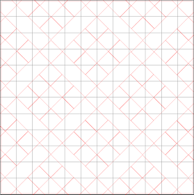
I started by designing a similar look in my Silhouette software. I kept with the diagonal feel but to make it my own, I chose to make smaller boxes to give it a zoomed out look and instead of piecing together triangles to form the squares, I kept the squares as whole pieces.
I chose to use 5 different colors with at least 5 - 7 different patterns within the color scheme. To cut these, I grouped the boxes together and cut multiples of each pattern in each color scheme. You can DOWNLOAD MY CUT FILE HERE. Repeat for each color scheme until you have lots of little piles of patterns for each color.
Next I used the internal offset feature, set to .79 to create smaller boxes. You can see two remaining external diamonds that still needed to be removed before I cut these. I kept them in the photo to demonstrate the internal offset. You can also DOWNLOAD THE CUT FILE I created with the internal offset images. Afterall, there's no need for us both to do all the work.
Once I removed the outside larger boxes, I used my sketch pen to draw a template on my cardstock. This made it easy peasy to know exactly where to place each square. I certainly didn't want my lines to get off and not match up halfway through the project. I went to town, adhering the squares on the cardstock with just a slight dab of liquid adhesive. I didn't want to add too much since I was going to sew over it.
Next, I really liked how Laureen stitched 3 rows over each full square so I chose to do the same. It was quite the task for all these little boxes but I LOVE the end result! I added layers behind my single photo, a sparkly title at an angle and a little cluster of embellishments in the corner to call this layout done. Actually, I still need to add the journaling, which I plan to do in the open diagonal space right below my photo.
I hope I inspired you today, the same way Laureen inspired me. If you download and use the cut files I created, please share them in the comments below, on the Scrapbook like a Superhero Facebook page AND on Instagram and tag me (@heatherleopard). I'd love to see what you create!


Truly paper engineering at it's finest!! Whoop!!
ReplyDeleteWHAT a GORGEOUS page!!! Pinning!
ReplyDeleteExcellent insights! I’ve recently been exploring Tips for Assignments that guide students on effective study techniques and better organization. These are great for anyone trying to balance multiple subjects. In addition, I came across Expert Academic Writing Solutions that offer customized support for essays, assignments, and academic writing projects. Using both can make academic life a lot smoother and more productive. Thanks for highlighting the importance of useful learning resources !
ReplyDelete