Pages

Thursday, November 28, 2013

I am Thankful {Card}

I am Thankful...
American Crafts Autumn Crisp collection

for health and happiness.

for all the blessings in my life and for those around me. 

for a husband who treats me like his princess and does so much for our family.

for 3 wonderful children who are the light of my life.

for the most amazing parents, who are a wonderful example to me, my family and everyone around them. I will always be grateful that they packed up and moved to be closer to us.

for a great job that helps provide for the family so we can do things and go places. It also allows me the flexibility to work from home and enables me to be there for my children any time I'm needed. This is especially important when you have a child with autism and severe ADHD. And, I love to see them off to school and be the first to see them when they get home.

for a hobby that allows me to express myself, de-stress a little every evening and has introduced me to some of the most talented people who share the same passion. I am lucky to call many of them close friends.

for scrapbooking manufacturer/kit club owners and design team leaders who believe in me.

for those of you who support and follow me on my blog, Instagram, Twitter, etc. and who also inspire me with your kind words and scrappy projects.

and so much more...

Thanks for stopping by today!

Wednesday, November 27, 2013

Made with Love

When I get to the end of a kit, like I did with the November Gossamer Blue kit, I always try to find a fun way to use the last last bit of kit leftovers, as evident with this layout. I still had this woodgrain paper that hadn't been touched as well as quite a bit of the paper with the hearts on it. It was already cut at an angle because I had used it for my "#favorite" layout for this month's Pattern Play blog post on the Gossamer Blue blog.

To create this page, I punched a row of hearts along the edge of my pink hearts paper and layered some strips of blue dot and pink scallop papers from my scraps, under the outer edge, which was just barely offset about 1/2" from the right side of the woodgrain paper. I then stitched the edges to give it a finished look.

 
Next, I pulled the fun tags from the kit and used them to help frame up my photo. I left oneof them unchanged but decided to alter two of them by simply adding strips of washi to one and an enamel heart to the other. I ladded more layers of paper,embellishments and a vellum frame to accent the photo even more. The last touch that I added to the photo was a resin bow right at her hairline.

 
I finished off the layout by adding bits and pieces, which included a vellum banner over a frame that I cut out, "XO" overlays, an "R" for Reese and a cute little bow with flower where I plan to journal.

I hope this will inspire you to make a scrap stash, if you don't already. I love that it challenges me to create a layout that I may never have thought to create had I been working with these elements when they first came out of the kit untouched.

Tell me, what do you do with your scraps? Do you chunk them, put them in a stash, maybe cut them up to make cards later? What do you do?

Monday, November 18, 2013

#favorite

#theseareafewofmyfavoritethings

These days, it's hashtag this and hashtag that in this social media frenzied world, with Instagram, Twitter and Facebook users finding #allsortsofcleverphrases to make hashtags out of. Even Jimmy Fallon and JT have #themosthilariousskit spoofing this trend.  Watch it at the end of my blog post. So #what'sagirltodo but create a layout using mostly hashtags. And the #November kit was #theperfectchoice.


I love the bold, dark colors mixed with the softer shades in this month's kit. I just knew I wanted to feature them together in a striking way so I chose to create a background paper using several of the patterns.


This page was actually a #happylittleaccident. I just #lovewhenthathappens. I was trying to cut certain angles that I had in mind and I learned after making the first two cuts that I had cut them wrong. The angles at the bottom left of the page didn't match up. Never one to waste paper, I went ahead and adhered them to the page, right next to each other and then I added a filler to help close the gap where the two patterns didn't line up. I went about cutting the rest of my papers however I wanted, which felt much less stressful and I just filled in the open spots here and there. I did have a method to my madness and still had to put thought into each cut but I didn't have to worry about exact matches.

If you want to recreate something like this, you could measure everything out perfectly and align them next to each other or you could do what I did:
  1. Choose 6 - 8 different pattern papers that coordinate well but also constrast each other.
  2. Use a 12x12 scrap piece of cardstock as the base of your layout.
  3. Starting on the left side of the background, choose 1 pattern paper. Keeping one side straight, cut the opposite side at an angle so that it's 12" long and has a smaller side at the bottom and larger side at the top but keeping a straight edge at the bottom and top, like how I did the pink hearts paper above. Lay it on the background paper.
  4. Next, choose another pattern paper and cut it each side at the same angle, leaving a stright edge at the top and bottom. Lay it on the background paper, tucking the top portion under the pink pattern paper.
  5. Continue to do this with all your patterns until you reach the right side of your background paper.
  6. For the final background piece, cut the left side at an angle and keep the right side straight, or trim it once you've adhered it down.
  7. Now add little snippits of pattern paper at the top and bottom, where you think it looks best, or where you have gaps.
  8. Once you've tucked papers under each other and like the way it looks, adhere them down. I chose to stitch over many of the seams.
  9. Now just add your photo(s), title and journaling. Depending on how busy your new background is, you may or may not choose to add a lot of other embellishments.
I used two additional pieces of pattern paper to mat my photos but they just weren't popping off the bold backgrounds like I wanted them to so I layered 2 of the Crate Paper canvas frames over the paper mats and stitched a little bit up at the top.

As I mentioned earlier, hash tags are all over the social media world so when I spotted one in the alphas in the kit, I knew exactly what to do next. I chose to title my page as a hash tag word AND do my journaling in hash tags phrases.


To complete my visual triangle, I added a little banner, which I cut from another canvas frame, to the top right and then added their ages in a collage on the bottom right. I realized after I took these photos that I didn't add a hashtag in front of their ages. I have since added this to the layout.


Don't be afraid to mix those bold and soft colors together and use a variety of patterns in your next project. You might just like what you see!

Thanks for stopping by today. Now, #watchthishilariousskit. It'll have you saying:
#showmethecookie
#imtherealcookiemonster
#nomnomnomnomnomnomnom
#lololololololololololololol
#orangeisthenewblack #purpleisthenewblack
#lifedecisions
#isitworthitletmeworkit
#isitfridayyet
#classic


Friday, November 15, 2013

Thankful for My Kids and Fall Adventures

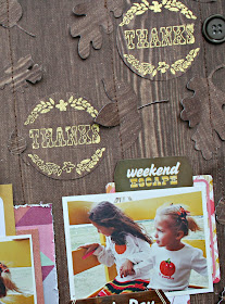
Fall adventures when the weather is supposed to be cooler is so much fun with the girls.  We usually head out to the pumpkin patch or Rennaisance festival and in general, just spend more time outside. 

When Paige asked me to create a layout for Thanksgiving week, I realized that with the hustle and bustle of a typical Thanksgiving day, I haven't taken many photos over the years.  I'm going to change that this year but in the meantime, I decided to create a layout about what I am thankful for. That would be adventures with my family, whether it's the day-to-day adventures or special trips and events. I am just so lucky to have those moments.

Supplies: Walnut Lane Paper (366518) - Autumn Crisp Collection, Autumn Avenue Paper (366514) - Autumn Crisp Collection, 6"x6" Paper Pad (366541) - Autumn Crisp Collection, Foliage Bits Die Cuts (366532) - Autumn Crisp Collection, Resin Buttons (366530) - Autumn Crisp Collection, Details Paper Clips (366534) - Autumn Crisp Collection, Redwood Phrase Stamp (366538) - Autumn Crisp Collection, Aspen with Foil Cardstock Stickers (366535) - Autumn Crisp Collection
If you saw this on the American Crafts blog yesterday, you may have read that this layout features gold embossed stamping, die cut leaves and hidden journaling. Let me tell you a little more.

When I was looking through the collection and shuffling things around, I really liked how the colors popped off of the background paper that I ended up using. I chose to go with a tone on tone look for the layout. I love the warm colors mixed with the woodgrain elements of the collection.  I also had some American Crafts Gold embossing powder with me and new I wanted to add some glam to the page using the new phrase stamp. So I did just that.

I stamped with versamark, added gold embossing powder, added some heat and then used a circle punch to punch them into circles.  I knew where I wanted my photos, so I placed them around the page, careful to avoid the photo area.
Next, I cut 3 - 4 different shaped leaves in 2 - 3 different sizes, using the same paper as the background and same paper as the punched stamp images.  I laid them in 5 rows and pointed them in all different directions. This time, I didn't worry about if they were placed where my photos would go. I actually wanted them showing out from behind.

Once all the leaves were stitched down, I added my photos and embellishments to the page, choosing only a select few embellishments.  I made a pocked for hidden journaling behind one of the photos to tell the story of this great adventure day.


Thanks for stopping by today. 

Tuesday, November 12, 2013

It’s the Little Things

The Gossamer Blue October kits were simply AH-MAZING! Like, wow amazing. It was packed with Crate Paper, Glitz, American Craft, Elle’s Studio, Pebbles and of course, the Gossamer Blue exclusives.  I love to mix the lines, but today, I couldn't resist the Glitz Design Finnley collection and the Gelatos from the color kit.

This whole layout started with the "just stay little" tulle skirt die cut at the bottom of the page.  Seriously, that one little thing inspired this all.  My daughter is enchanted with these dresses and all things girly and I just love it!  I usually start with the photo but I knew I’d have plenty to choose from because she has one of these dresses in just about every photo I have of her from the last 2 – 3 years.

I always tell her that I just want her to stay little and how much hope I have for her future so the cards layered under the photo were a perfect complement to it all. I use the Dream Big Little One card for hidden journaling.

Then I sorted through the Glitz word stickers and found so many that described her perfectly. I laid everything out without adhering it to the paper, snapped a photo of the layout, so I’d know where to put it all later, and then deconstructed it.

Now it was time for the gelatos!  OMG, these are so fun.  They are like little crayons that you can color with directly on your paper or you can apply them to a non sticky mat first. I chose to apply them in a random pattern direct to my paper and then I used a water soaked paint brush to paint and swirl it around in a lovely
watercolor pattern.  I did this down the left side of the page and again under the photo area.

Once dried, I put everything back in it’s place. I adhered it all down and did a bit of final stitching over the triangles.  A bit messy? Yes. A lot of fun? Absolutely yes! A unique new layout? Of course!

Have you ever played with gelatos? If not, make sure to check them out. They are soo much fun! Thanks for stopping by today. Now go on and get crafty!

Thursday, November 7, 2013

She's So Sophisticated

This girl, she's just so dang cute! She loves to be all fancy all the time.  I spotted her playing with a Barbie and her new purse that my mom brought back for her from an overseas trip and what do you know? She was wearing my mom's glasses too. She looked so cute and I couldn't resist snapping a few photos of her on my phone. 
 
To create this layout, I trimmed various coordinating papers into different size strips and adhered that to the left side of the page.  I then placed my photos on the opposite side of the page and did something I seldomly do. I did not add a lot of layers under them. I felt that I had enough going on with the strips on the left and instead, I chose to add some paint splatters, a few embellishments and sticker phrases that I thought perfectly related to her.

Look at her peeking up at me. As I mentioned in my journaling, it looks like she's saying "May I help you?"

The title fit perfectly in the little corner there between my photos.
 
 I split the journaling up on my layout bu actually cutting the journaling card in half and using one section in the upper left and the other in the bottom right. The journaling is tied together but not dependent on each other.